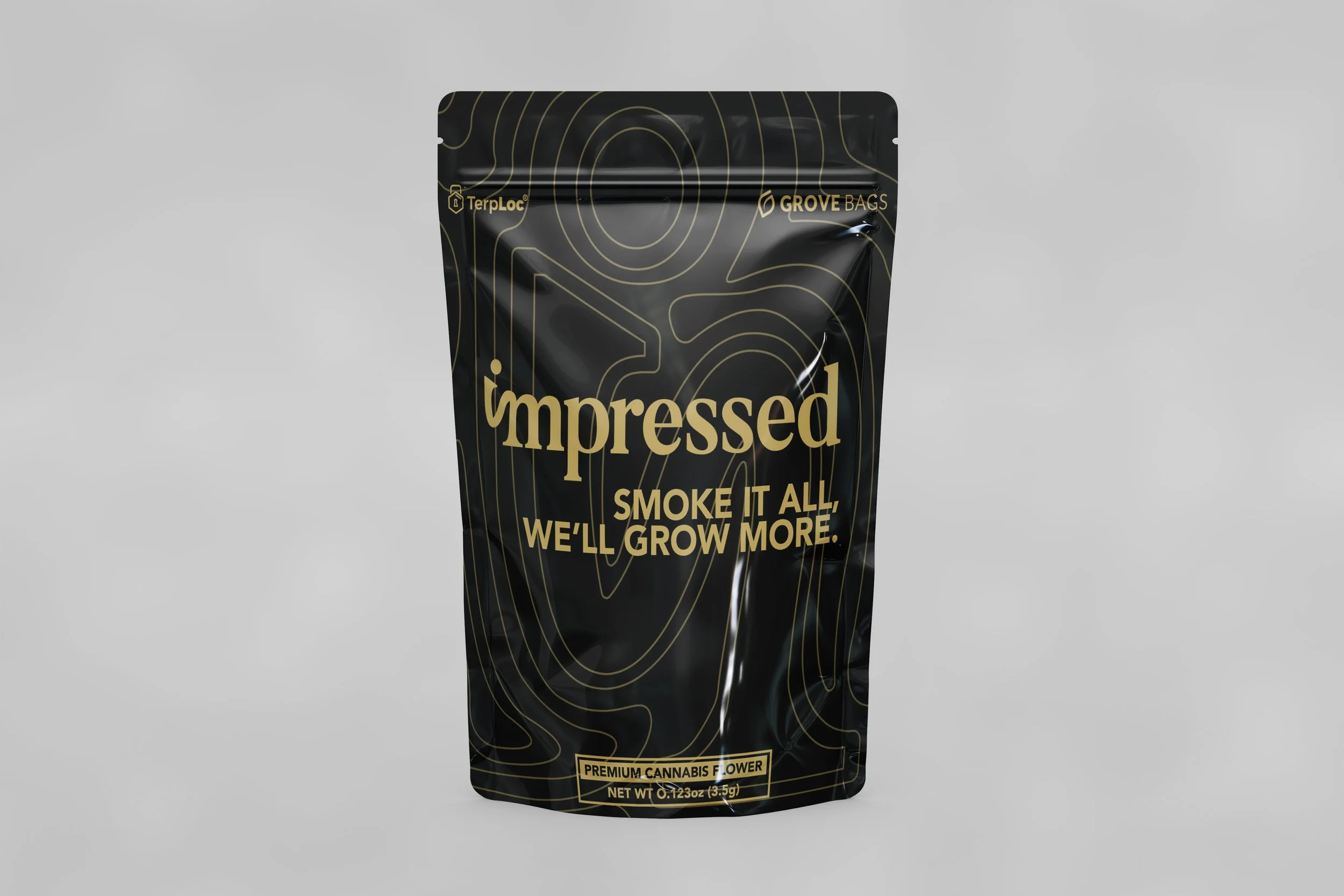
Impressed Package Design
When asked to design a package for a cultivating center the client wanted something clean but effective. I was given a logo as well as required elements to the package. I provided the client with other options but they ended up choosing my favorite, the topographic map design.
When creating the design for the topographic map I used the brands icon logo as the center and worked from there. I didn’t want to make sure the brands primary logo was the focus but also have the map as another element that customers would notice holding the bag. I believe having hidden elements like that help extend a brands identity because it makes the customer to associate the brand with more than one thing at once. The typeface was chosen by myself but the client chose the colors and I agree with this color palette. I think it stands out on shelves and will be something different that what is traditionally designed.


